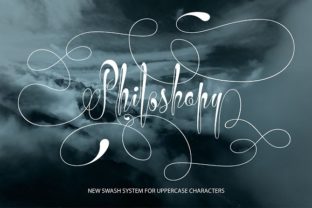
Philoshopy: A Swash Script Font for Digital Branding
As a web designer who builds landing pages, SaaS dashboards, and boutique e-commerce experiences, I evaluate fonts not just by aesthetics—but by how they perform in real layouts: how they guide the eye, reinforce brand voice, and hold up across devices. Philoshopy stands out as a refined swash script font built for uppercase display use—and it’s quickly become my go-to for moments where elegance needs to land without sacrificing clarity.
Philoshopy belongs to the Script Amp category: a modern interpretation of calligraphic energy, optimized for digital screens. Its defining trait is its expressive, rhythmic swashes—carefully balanced so they enhance rather than overwhelm. Unlike overly ornate scripts that blur at small sizes or compete with interface elements, Philoshopy’s swashes are intentional, generous, and anchored in strong letterforms. It feels hand-drawn but engineered—ideal for designers who want personality without unpredictability.
Where Philoshopy Earns Its Place on Screen
This isn’t a body text font—and it shouldn’t be. Philoshopy shines where impact matters most: hero section headlines, product name treatments, CTA banners, and branded content headers. On a coaching website’s hero banner, “Your Journey Starts Here” set in Philoshopy (with tight tracking and ample line height) adds warmth and authority without feeling corporate or cold. In an online boutique’s seasonal campaign banner—“SUMMER EDIT”—the swashes lend movement and seasonality while keeping the message instantly scannable.
It works especially well in contexts where users scan first and read second. Because Philoshopy is uppercase-only and swash-forward, it encourages quick recognition of key terms—not full sentences. That makes it ideal for section dividers (“TESTIMONIALS”, “FEATURES”, “PRICING”), app onboarding slides, or course module titles. On mobile, I use it at 36–48px with generous letter-spacing and always pair it with a highly legible sans serif (like Inter or Manrope) for supporting copy—ensuring hierarchy remains clear even on smaller viewports.
Readability & Responsiveness: Practical Considerations
Philoshopy performs reliably against both light and dark backgrounds—but contrast is non-negotiable. On white or light gray, I recommend a subtle drop shadow or stroke only when layered over busy image overlays. On dark mode interfaces, I avoid thin weight variants (if available) and stick to the standard weight with a clean background buffer. It’s not designed for micro-interactions or button labels under 16px; reserve those spaces for functional typography.
For accessibility, I never use Philoshopy alone for critical UI text—no navigation links, form labels, or error messages. But as a decorative layer atop accessible HTML headings ( with semantic fallback), it elevates tone without compromising compliance. Always test contrast ratios using tools like axe or Lighthouse, especially when applying color overlays or gradients.
Font Pairing That Supports, Not Competes
Philoshopy thrives in contrast. Its expressive nature demands a calm, confident partner. I consistently pair it with neutral, highly readable sans serifs—Inter for UI-heavy apps, Poppins for landing pages, or Montserrat for editorial-leaning blogs. For brands leaning into sophistication (think premium skincare or design studios), a crisp serif like Playfair Display or Cormorant Garamond in body copy creates elegant tension without visual noise.
Avoid pairing Philoshopy with other script or handwritten fonts—even subtle ones. The swashes already carry tonal weight; adding another decorative layer dilutes focus. And skip condensed or ultra-light sans serifs: they lack the structural presence needed to balance Philoshopy’s amplitude.
Licensing, Formats & Real-World Integration
Before deploying Philoshopy on a live site, verify licensing scope. Most Script Amp fonts—including Philoshopy—offer webfont packages (WOFF2, WOFF) compatible with self-hosted sites and major platforms like Webflow or Shopify. If you’re building client-facing products, templates, or digital brand kits, confirm whether the license covers redistribution or SaaS embedding. Some versions include stylistic alternates or multilingual glyphs (Latin Extended-A, basic diacritics)—check the specimen before finalizing for global audiences.
I’ve used Philoshopy successfully in Figma for design system tokens, exported as static assets for social ads, and embedded via @font-face with fallback stacks. It loads quickly when properly subsetted (e.g., only uppercase + punctuation), and its OpenType features support manual swash toggling if your stack allows.
When to Reach for Philoshopy—And When to Pause
Reach for Philoshopy when:
- You need a bold, ownable header for a creative portfolio or personal brand site
- Your online store highlights craftsmanship, artistry, or slow-living values
- A course sales page benefits from typographic warmth—without sacrificing professionalism
- You’re designing a digital brand kit and want one signature display font that scales across web, email, and social graphics
Pause before using Philoshopy when:
- The context demands neutrality (e.g., fintech dashboards, legal disclaimers)
- You’re working with tight character limits (under 10 characters) where swashes may feel cramped
- Brand guidelines require strict type consistency across print and digital—and Philoshopy lacks matching lowercase or numeral sets
Philoshopy doesn’t try to be everything. It’s a focused tool—a premium font for moments that deserve emphasis, emotion, and intention. Used thoughtfully, it strengthens visual hierarchy, deepens brand resonance, and quietly signals care in craft. That’s why it’s earned space in my core design toolkit—not as decoration, but as deliberate, functional typography.