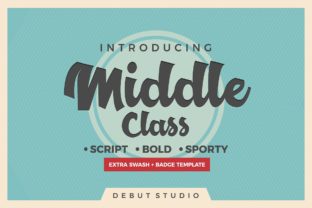
Middle Class Script Font for Digital Branding
There it was—my third revision of the hero section for a new coaching website, and something still felt off. The headline read “Your Calm, Clarified,” set in a clean sans serif I’d used for years. It was legible, professional, even trustworthy—but it wasn’t *alive*. Not quite. So I swapped it out for Middle Class, loaded the webfont, adjusted the letter spacing, and watched the whole section exhale. Suddenly, the tone shifted: warm but intentional, personal but polished, human without being casual. That’s when I knew this wasn’t just another script font—it was a digital brand amplifier.
A Display Font That Carries Voice, Not Just Style
Middle Class Script lives firmly in the Script Amp category—not as a delicate handwritten whisper, but as a confident, playful, and rhythmically expressive typeface. Its baseline has gentle bounce, its terminals flare with intention, and those extra swashes? They’re not afterthoughts—they’re design levers. In practice, that means a single word like “Gather” or “Bloom” or “True” gains instant personality and emotional resonance. On a landing page banner, it doesn’t shout; it leans in and invites. As a display font, it’s built for impact at larger sizes (36px and up), where its curves, contrast, and character shine without sacrificing clarity.
How It Performs Where It Matters Most
I tested Middle Class across real layout scenarios—not just mockups, but live previews on iOS, Android, and desktop Chrome:
- Hero headlines: At 48–64px on light backgrounds, it rendered crisply—even with subtle text-shadow for depth over image banners.
- Section headings: Paired beautifully with Inter (a neutral, highly legible sans) at 32px. The contrast created clear hierarchy without visual competition.
- CTA buttons: Used sparingly (e.g., “Start Your Journey”) at 20px on pill-shaped buttons—still readable, especially with generous padding and high-contrast background colors.
- Branded graphics: Exported as SVG for social media banners and email headers—no hint of pixelation, even when scaled.
What surprised me most was how well it held up on mobile. Unlike some ornate scripts that blur or collapse at smaller sizes, Middle Class maintains its integrity down to ~24px on retina displays—enough for short labels in a product gallery or a featured testimonial tagline.
Where It Shines—and Where to Pause
This isn’t a workhorse font for body copy, navigation menus, or form fields—and it shouldn’t be. Its strength lies in intentional emphasis. I used it for:
- The “Welcome” header on a course sales page—paired with Lora for subheadings and Open Sans for body text.
- A boutique online store’s seasonal campaign banner (“Summer Slow Down”)—set over a soft-focus photo with 70% opacity overlay.
- A portfolio homepage’s “About Me” intro line (“Designing with heart & precision”)—small caps + light tracking for modern elegance.
- A digital brand kit’s logo lockup variant (text-only version), where the swash on the “C” in “Class” became a subtle signature detail.
But I avoided it for:
- Paragraph text—even at 18px, readability dropped noticeably in longer blocks.
- Mobile navigation labels: too decorative for quick scanning.
- Accessibility-critical elements like error messages or required field indicators.
- Dark mode interfaces with low contrast—some swashes lost definition against deep charcoal backgrounds unless given a light stroke or background highlight.
Smart Pairing Makes All the Difference
Middle Class thrives in contrast. Its playful energy needs grounding—and that’s where smart font pairing becomes essential. I landed on two reliable combinations:
- Sans serif anchor: Inter, Poppins, or Manrope for all functional text—body copy, captions, buttons, metadata. Their neutrality lets Middle Class breathe and lead.
- Subtle serif lift: Lora or Playfair Display (light or regular weight) for subheadings or pull quotes—adds editorial warmth without competing.
Crucially, I checked what came in the package before implementation: Middle Class includes OpenType features like discretionary ligatures and swash alternates—accessible via CSS font-feature-settings or design tools like Figma. That meant I could activate the elegant “&” or the looping “t” only where it elevated meaning—not as default clutter. Also confirmed: WOFF2 support, full Latin character set, and commercial licensing cleared for client sites and SaaS dashboards.
More Than Typography—It’s Tone Architecture
In digital design, every font choice is a quiet contract with your visitor. Middle Class Script signals approachability without sacrificing sophistication. It tells users, “This space values craft, care, and clarity—not just speed.” On a coaching site, it softens authority into warmth. On a creative portfolio, it adds signature flair without pretense. On a product landing page, it makes benefits feel personal, not transactional.
Yes, it’s a script font. But more accurately, it’s a brand identity tool—one that performs reliably across devices, supports thoughtful hierarchy, and scales gracefully from desktop hero to mobile CTA. It won’t solve your UX flow or content strategy—but when placed with intention, it helps your message land exactly as you mean it to: human, memorable, and unmistakably yours.